Bright Moon Digital, USA
Case Study · Logo Design
Client: Bright Moon Digital, USA
Overview
Bright Moon Digital required a logo that reflects clarity, balance, and a distinctive visual identity in a competitive digital environment.
Challenge
The existing visual direction lacked focus and recognizability. It did not create a memorable impression or clearly communicate the brand’s character.
Approach
The objective was to create a minimal and meaningful logo built on clarity and symbolism.
I focused on reducing visual noise and developing a mark that is both simple and distinctive.
Key considerations included:
- a clean and recognizable logo form
- a balanced and timeless visual expression
- clarity and memorability at different scales
Solution
A minimal, symbol-driven logo designed for strong recognition and flexible use across digital and print applications.
Result
The new logo presents Bright Moon Digital as a clear and confident brand, improving recognition and strengthening its visual identity.
What this means for the client:
A logo that communicates clearly and builds trust through simplicity.

Final Logo Version
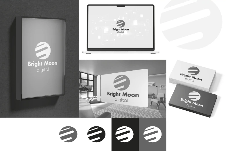
Mockups
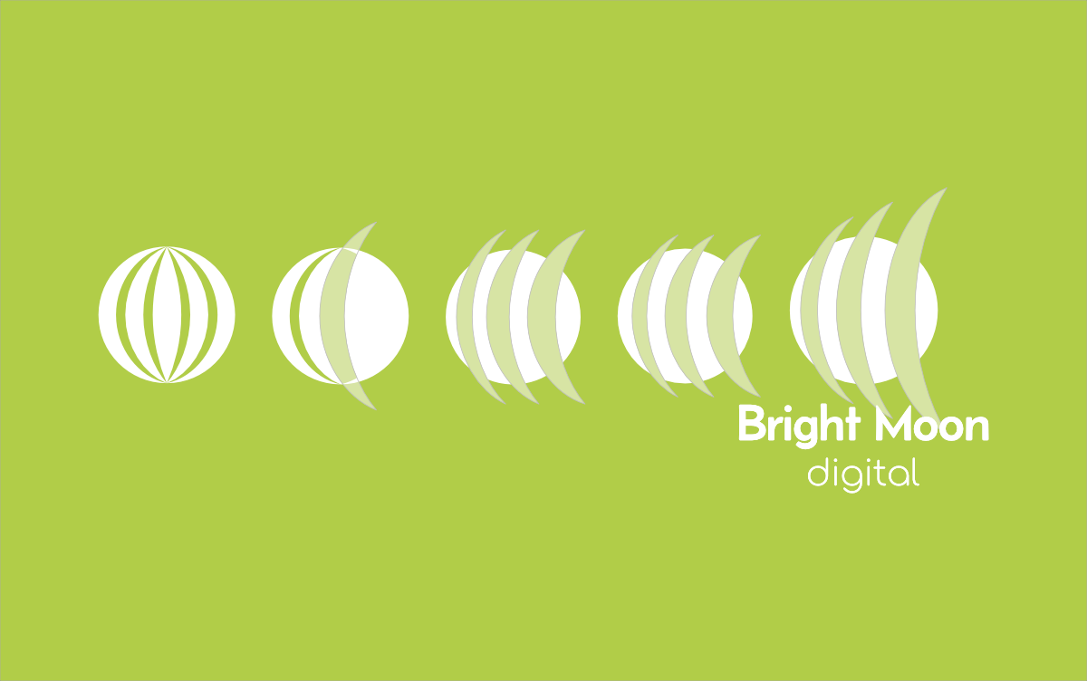
Developing Phases
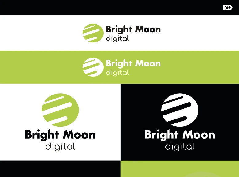
Detailed Logo Information
Ready to build a brand that works as hard as you do?
Most projects start with a 30-minute call. No pressure, no pitch — just an honest conversation about where you are and where you want to be.